some_model <- lm(body_mass ~ flipper_len, data = penguins)

broom::tidy(some_model)
## # A tibble: 2 × 5
##   term        estimate std.error statistic   p.value
##   <chr>          <dbl>     <dbl>     <dbl>     <dbl>
## 1 (Intercept)  -5781.     306.       -18.9 5.59e- 55
## 2 flipper_len 49.7 1.52 32.7 4.37e-107Week 2.5 tips and FAQs
FAQs
Hi everyone!
I haven’t figured out a good cadence for these FAQs because the questions/issues/feedback are all happening at different times! Your check-ins are due on Thursdays and your problem sets are due on Fridays, but I don’t actually look at them until Mondays to give you some unofficial wiggle room over the weekend.
So, until I find a better time to post these, you get a special mid-week FAQ post. You’re so lucky!
My p-values are showing up as 2.3e-7. What does that mean?
This can be tricky at first! If you see a p-value of 2.3e-7, it’s tempting to say that the p-value is 2.3, and then you’d conclude that the coefficient isn’t significant because it’s higher than 0.05. BUT (1) p-values can’t be higher than 1 or lower than 0, and (2) 2.3e-7 isn’t the same as 2.3!
The e-7 there is a sign that something different is happening. It’s R’s notation for scientific notation, or \(10^{-7}\):
\[ \texttt{2.3e-7} = 2.3 \times 10^{-7} \]
Practically speaking, it means you should move the decimal place to the left 7 places:
\[ \texttt{2.3e-7} = 2.3 \times 10^{-7} = 0.00000023 \]
This works the other way too. If you see a number like 4.1e6, that means \(4.1 \times 10^6\), so you should move the decimal place to the right 6 places:
\[ \texttt{4.1e6} = 4.1 \times 10^6 = 4,100,000 \]
Sometimes R says that my p-value is 0—is that correct? Is it okay to have tiny p-values?
When you’re working with really small p-values, R will sometimes try to round them and show them as 0. That’s not true. The p-value might be really really small, but it’s never 0.
For instance, here’s a little model:
The p-value for flipper_len is tiny. It’s 4.37e-107, or \(4.37 \times 10^{-107}\), or 0.000(imagine 100 more 0s here)000037
What that means, practically speaking, is that in a world where there’s no relationship between flipper length and body mass, or in a world where the slope of flipper_len is 0ish, the probability of seeing a slope like 49.7 is 0.000…00037%. So we’re pretty confident that it’s not 0.
Is it useful to know that the slope isn’t 0? Probably not in this case. The p-value gives us an answer to a question that we don’t really care that much about.
So how do you handle really really tiny p-values? First, don’t ever say that they’re 0—that’s wrong. Instead, follow what the APA recommends:
- Report exact p values to two or three decimals (e.g., p = .006, p = .03).
- However, report p values less than .001 as “p < .001”.”
If a p-value is tiny and less than 0.001, just write that it’s less than 0.001. There’s no need for tinier precision.
One advantage of using model_parameters() from {parameters} is that it does this automatically:
parameters::model_parameters(some_model)
## Parameter   | Coefficient |     SE |               95% CI | t(340) |      p
## ---------------------------------------------------------------------------
## (Intercept) |    -5780.83 | 305.81 | [-6382.36, -5179.30] | -18.90 | < .001
## flipper len |       49.69 |   1.52 | [   46.70,    52.67] |  32.72 | < .001
##
## Uncertainty intervals (equal-tailed) and p-values (two-tailed) computed
##   using a Wald t-distribution approximation.
If you want to format tiny p-values yourself outside of model_parameters(), you can use the label_pvalue() function from {scales}:
scales::label_pvalue()(2.3e-7)
## [1] "<0.001"
What’s the difference between the |> and %>% pipes?
They both do the same thing—take the thing on the left side of the pipe and feed it as the first argument to the function on the right side of the pipe. 99% of the time they’re interchangeable. |> is the native pipe and is part of R—you don’t need to load any packages to use it. The %>% is not native and requires you to load a package (typically tidyverse) to use it.
Why do we sometimes combine code with + and sometimes with |>?
This is tricky!
tl;dr: + is only for ggplot plotting. |> is for combining several functions.
If you’re combining the results of a bunch of functions, like grouping and summarizing and filtering, you connect these individual steps with the pipe symbol—you’re feeding each step into the next step in the pipeline. If you find yourself using the phrase “and then” (which is the English equivalent of the pipe), like “Take the mpg dataset and then filter it to remove 5 cylinder cars and then group it by cylinder and then calculate the average highway MPG in each cylinder”, use |>:
mpg |>
  filter(cyl != 5) |>
  group_by(cyl) |>
  summarize(avg_mpg = mean(hwy))
## # A tibble: 3 × 2
##     cyl avg_mpg
##   <int>   <dbl>
## 1     4    28.8
## 2     6    22.8
## 3     8    17.6
If you’re plotting things with ggplot, you’re adding layers together, not connecting them with pipes:
ggplot(data = mpg, mapping = aes(x = displ, y = hwy, color = drv)) +
  geom_point() +
  labs(title = "Neato")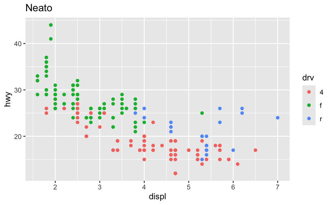
It’s even possible to combine them into a single chain. Note how this uses both |> and +, but only uses + in the ggplot section:
mpg |>
  filter(cyl != 5) |>
  group_by(cyl) |>
  summarize(avg_mpg = mean(hwy)) |>
  ggplot(aes(x = factor(cyl), y = avg_mpg)) +
  geom_col() +
  labs(title = "Average MPG across cylinders")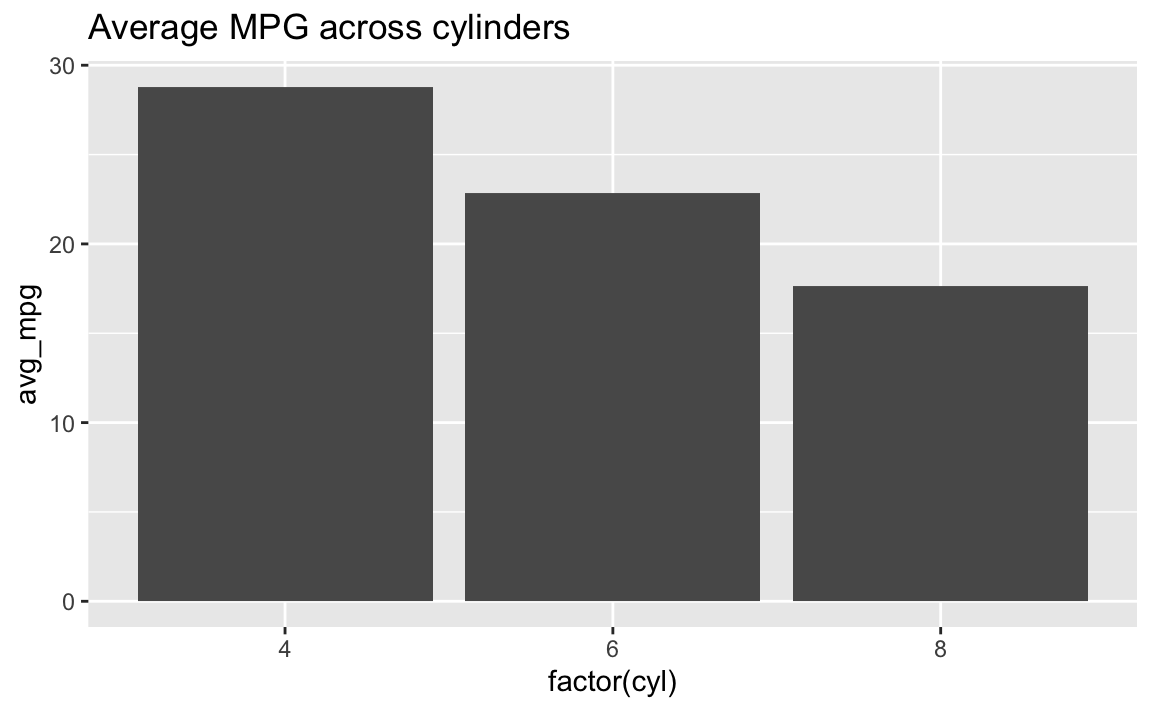
↑ I don’t typically like doing this though, since it’s a little brain-breaking to switch between |> and +. I typically make a smaller dataset and save it as an object and then plot that, like this:
summarized_data <- mpg |>
  filter(cyl != 5) |>
  group_by(cyl) |>
  summarize(avg_mpg = mean(hwy))

ggplot(data = summarized_data, aes(x = factor(cyl), y = avg_mpg)) +
  geom_col() +
  labs(title = "Average MPG across cylinders")
Why doesn’t group_by(Species) work but group_by(species) does?
R—like pretty much all other programming languages—is case sensitive. To the computer, species and Species are completely different things. Your code has to match whatever the columns in the data are.
The Environment panel is really helpful for this. If you click on the little blue arrow next to a dataset in the Environment panel, it’ll show you what the columns are called. You could also click on the name of the dataset and open it in a separate tab, which can be helpful, but if I just need to remind myself what the column is called, that blue arrow is perfect.
![]()
There’s nothing special about having capitalized column names either—they just happen to be lower case in this one dataset. You could rename them to be capitalized:
penguins |>
  rename(Species = species)
…or all caps:
penguins |>
  rename(SPECIES = species)
…or something else entirely:
penguins |>
  rename(the_species_of_the_penguin = species)
All that matters is that you use the names as they appear in the data, matching the case exactly.
Why does aes() sometimes appear in ggplot() and sometimes in geom_WHATEVER()?
These two chunks of code make the exact same plot:
ggplot(data = mpg, mapping = aes(x = displ, y = hwy, color = drv)) +
  geom_point()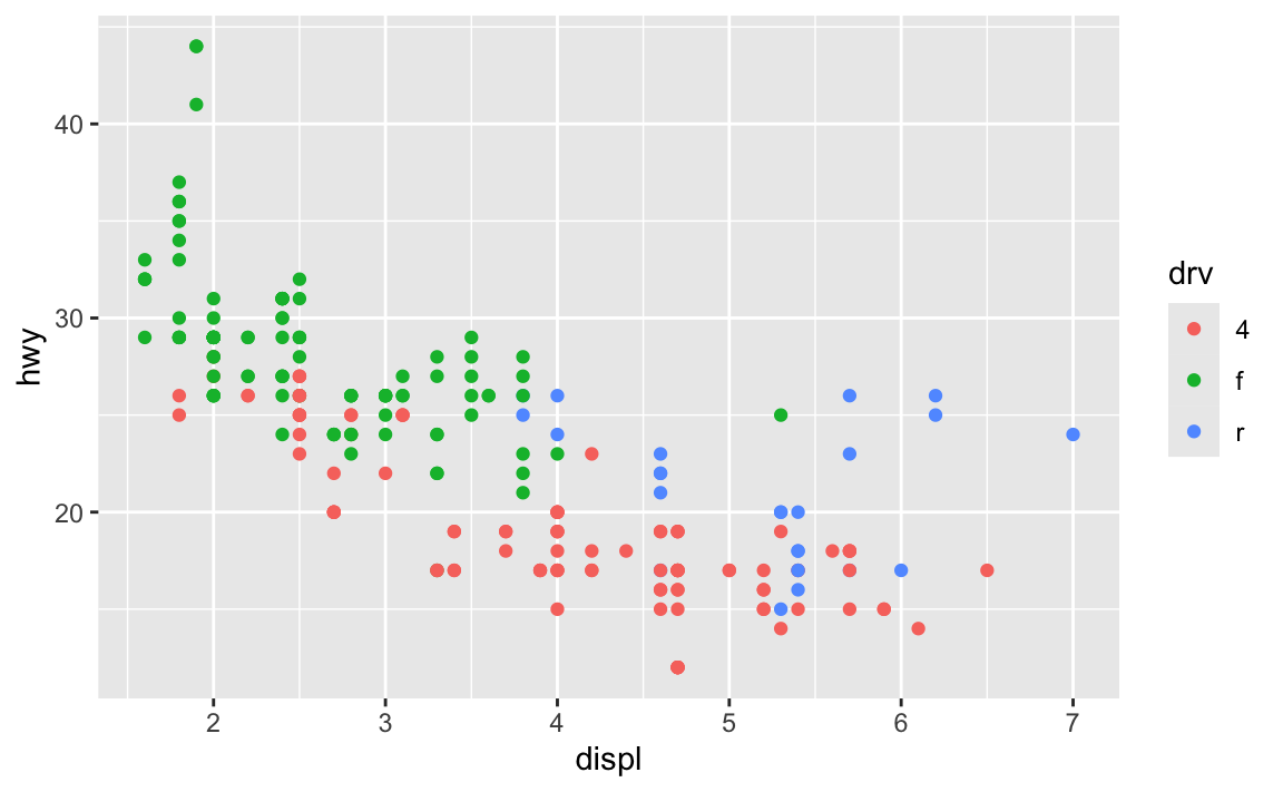
ggplot(data = mpg) +
  geom_point(mapping = aes(x = displ, y = hwy, color = drv))
The first has the aesthetic mappings inside ggplot(); the second has them inside geom_point(). Which one is better? Why allow them to be in different places? What’s going on?!
The Primers briefly covered this in a section called “Global vs. local mappings”. The basic principle is that any aesthetic mappings you set in ggplot() apply globaly to all layers that come after while any aesthetic mappings you set in geom_WHATEVER() apply locally only to that geom layer.
If I want to add points and a smoothed line, I could do this:
ggplot(data = mpg) +
  geom_point(mapping = aes(x = displ, y = hwy, color = drv)) +
  geom_smooth(mapping = aes(x = displ, y = hwy, color = drv))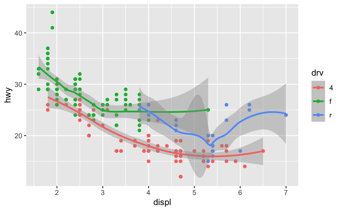
…but that’s a lot of duplicated code!
Instead, I can set the mapping in ggplot(), and it’ll apply to all the layers:
ggplot(data = mpg, mapping = aes(x = displ, y = hwy, color = drv)) +
  geom_point() +
  geom_smooth()
You can still set specific aesthetics for specific geoms. Like, what if I want the points to be colored, but I want a single smoothed line, not three colored ones? I can put color = drv in geom_point() so that geom_smooth() doesn’t use color:
ggplot(data = mpg, mapping = aes(x = displ, y = hwy)) +
  geom_point(mapping = aes(color = drv)) +
  geom_smooth()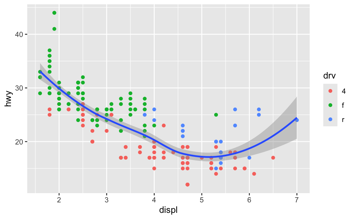
In general it’s good to put your aes() stuff inside ggplot() unless you’re doing specific things with individual geoms.
Installing vs. using packages
One thing that trips often trips people up is the difference between installing and loading a package.
The best analogy I’ve found for this is to think about your phone. When you install an app on your phone, you only do it once. When you want to use that app, you tap on the icon to open it. Install once, use multiple times.
The same thing happens with R. If you look at the Packages panel in RStudio, you’ll see a list of all the different packages installed on your computer. But just because a package is installed doesn’t mean you can automatically start using it—you have to load it in your R session using library(nameofthepackage). Install once, use multiple times.
Every time you restart RStudio and every time you render a Quarto document, R starts with no packages loaded. You’re responsible for loading those in your document. That’s why the beginning of every document typically has a bunch of library() lines, like this:
library(tidyverse)
library(scales)
library(gapminder)
As mentioned in this earlier list of tips, make sure you don’t include code to install packages in your Quarto files. Like, don’t include install.packages("tidyverse") or whatever. If you do, R will reinstall that package every time you render your document, which is excessive and slow. All you need to do is load the package with library()
To help myself remember to not include package installation code in my document, I make an effort to either install packages with my mouse by clicking on the “Install” button in the Packages panel in RStudio, or only ever typing (or copying/pasting) code like install.packages("whatever") directly in the R console and never putting it in a chunk.
Why are my axis labels all crowded and on top of each other? How do I fix that?
This is a common problem! Fortunately there are a few quick and easy ways to fix this, such as changing the width of the image, rotating the labels, dodging the labels, or (my favorite!) automatically adding line breaks to the labels so they don’t overlap. This blog post (by me) has super quick examples of all these different (easy!) approaches.
Most of the time, you can just adjust the figure dimensions using chunk options like this:
```{r}
#| fig-width: 8
#| fig-height: 3

# Code for some plot that needs to be wider
```
Why isn’t the example code using data = whatever and mapping = aes() in ggplot() anymore? Do we not have to use argument names?
In the primers and the first assignment, you wrote code that looked like this:
ggplot(data = penguins, mapping = aes(x = flipper_len, y = body_mass)) +
  geom_point()
In R, you feed functions arguments like data and mapping and I was having you explicitly name the arguments, like data = penguins and mapping = aes(...).
In general it’s a good idea to use named arguments, since it’s clearer what you mean.
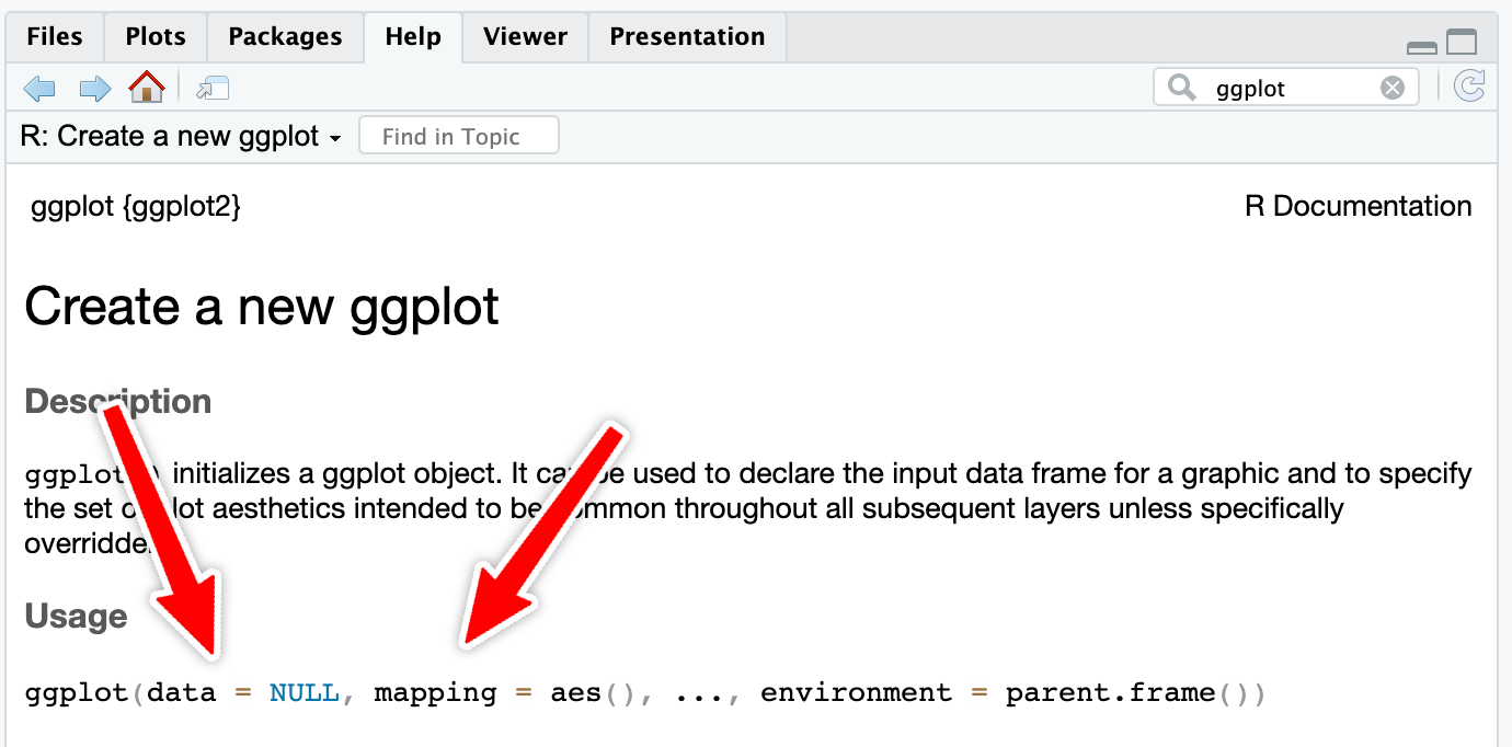
However, with really common functions like ggplot(), you can actually skip the names. If you look at the documentation for ggplot() (i.e. run ?ggplot in your R console or search for “ggplot” in the Help panel in RStudio), you’ll see that the first expected argument is data and the second is mapping.
If you don’t name the arguments, like this…
ggplot(penguins, aes(x = flipper_len, y = body_mass)) +
  geom_point()
…R will assume that the first argument (penguins) really means data = penguins and that the second really means mapping = aes(...).
If you don’t name the arguments, the order matters. This won’t work because ggplot will think that the aes(...) stuff is really data = aes(...):
ggplot(aes(x = flipper_len, y = body_mass), penguins) +
  geom_point()
If you do name the arguments, the order doesn’t matter. This will work because it’s clear that data = penguins (even though this feels backwards and wrong):
ggplot(mapping = aes(x = flipper_len, y = body_mass), data = penguins) +
  geom_point()
This works with all R functions. You can either name the arguments and put them in whatever order you want, or you can not name them and use them in the order that’s listed in the documentation.
In general, you should name your arguments for the sake of clarity. For instance, with aes(), the first argument is x and the second is y, so you can technically do this:
ggplot(penguins, aes(flipper_len, body_mass)) +
  geom_point()
That’s nice and short, but you have to remember that flipper_len is on the x-axis and body_mass is on the y-axis. And it gets extra confusing once you start mapping other columns:
ggplot(penguins, aes(flipper_len, body_mass, color = species, size = bill_len)) +
  geom_point()
All the other aesthetics like color and size are named, but x and y aren’t, which just feels… off.
So use argument names except for super common things like ggplot() and the {dplyr} verbs like mutate(), group_by(), filter(), etc.
What’s the difference between read_csv() vs. read.csv()?
In all the code I’ve given you (and will give you) in this class, you’ve loaded CSV files using read_csv(), with an underscore. In lots of online examples of R code, and in lots of other peoples’ code, you’ll see read.csv() with a period. They both load CSV files into R, but there are subtle differences between them.
read.csv() (read dot csv) is a core part of R and requires no external packages (we say that it’s part of “base R”). It loads CSV files. That’s its job. However, it can be slow with big files, and it can sometimes read text data in as categorical data, which is weird (that’s less of an issue since R 4.0; it was a major headache in the days before R 4.0). It also makes ugly column names when there are “illegal” columns in the CSV file—it replaces all the illegal characters with .s
NoteLegal column names
R technically doesn’t allow column names that (1) have spaces in them or (2) start with numbers.
You can still access or use or create column names that do this if you wrap the names in backticks, like this:
penguins |>
  drop_na(sex) |>
  group_by(species) |>
  summarize(`A column with spaces` = mean(body_mass))
## # A tibble: 3 × 2
##   species   `A column with spaces`
##   <fct>                      <dbl>
## 1 Adelie                     3706.
## 2 Chinstrap                  3733.
## 3 Gentoo                     5092.
read_csv() (read underscore csv) comes from {readr}, which is one of the 9 packages that get loaded when you run library(tidyverse). Think of it as a new and improved version of read.csv(). It handles big files better, it doesn’t ever read text data in as categorical data, and it does a better job at figuring out what kinds of columns are which (if it detects something that looks like a date, it’ll treat it as a date). It also doesn’t rename any columns—if there are illegal characters like spaces, it’ll keep them for you, which is nice.
Moral of the story: use read_csv() instead of read.csv(). It’s nicer.
What’s the difference between facet_grid() and facet_wrap()?
Both functions create facets, but they do it in different ways. facet_grid() creates a grid with a set number of rows and columns, and it puts the labels of those rows and columns in the strips along the facets. Here’s a little example with data from gapminder.
library(gapminder)

gapminder_small <- gapminder |>
  filter(year >= 2000)
We can facet with year as columns:
ggplot(gapminder_small, aes(x = gdpPercap, y = lifeExp, color = continent)) +
  geom_point() +
  guides(color = "none") +
  facet_grid(cols = vars(year))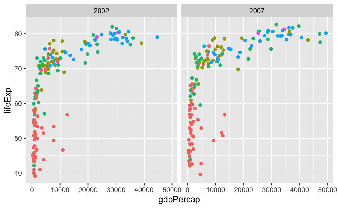
…or year as rows:
ggplot(gapminder_small, aes(x = gdpPercap, y = lifeExp, color = continent)) +
  geom_point() +
  guides(color = "none") +
  facet_grid(rows = vars(year))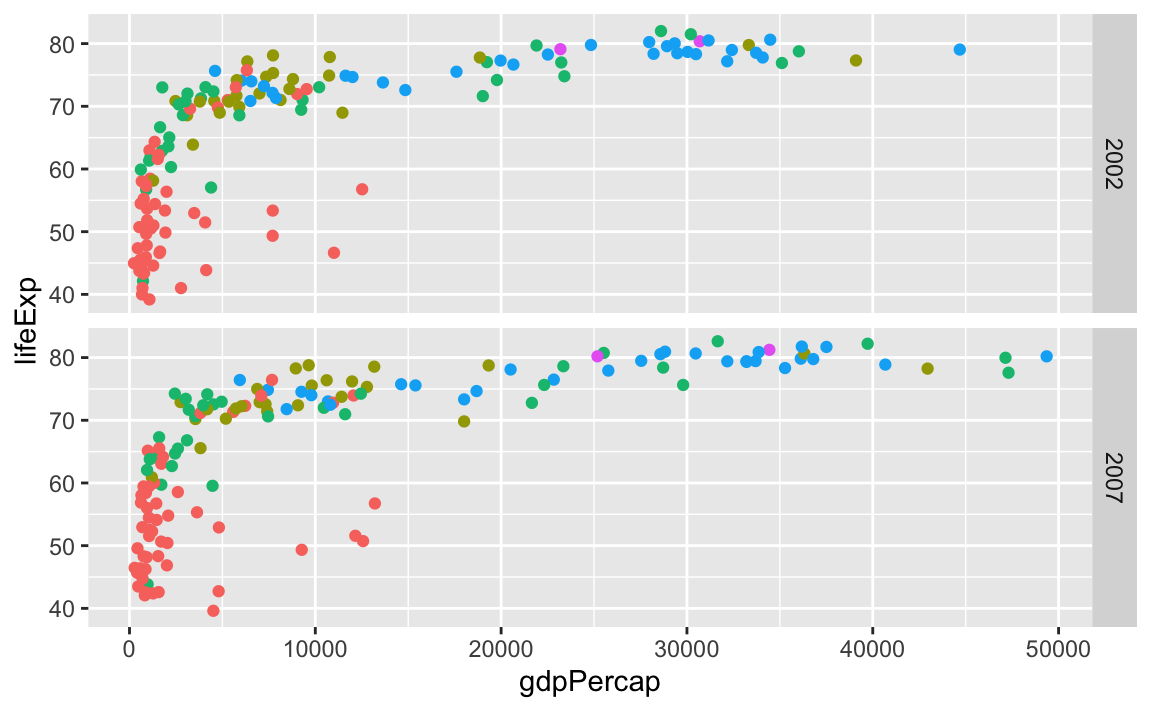
We can even facet with year as rows and continent as columns:
ggplot(gapminder_small, aes(x = gdpPercap, y = lifeExp, color = continent)) +
  geom_point() +
  guides(color = "none") +
  facet_grid(cols = vars(continent), rows = vars(year))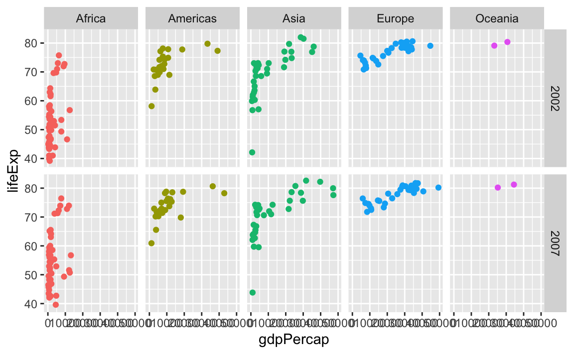
facet_wrap() works a little differently. It lays out each subplot in a line and then moves to the next line once that line gets filled up. Imagine typing text in Word or Google Docs—when you get to the end of the line, the text automatically moves down to the next line.
By default, it’ll try to choose a sensible line length to keep things balanced. Like here there are three plots in the first row and two in the second:
ggplot(gapminder_small, aes(x = gdpPercap, y = lifeExp, color = continent)) +
  geom_point() +
  guides(color = "none") +
  facet_wrap(vars(continent))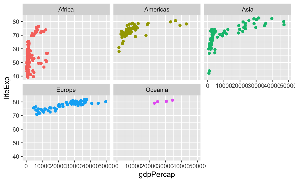
You can control how long the lines are with the ncol and nrow arguments. Like if I want only two plots per row, I’d do this:
ggplot(gapminder_small, aes(x = gdpPercap, y = lifeExp, color = continent)) +
  geom_point() +
  guides(color = "none") +
  facet_wrap(vars(continent), ncol = 2)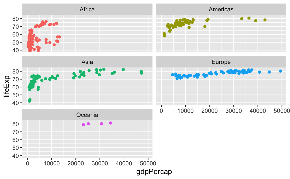
Or if I want only one row, I could do this (or alternatively, I could use ncol = 5—that would do the same thing):
ggplot(gapminder_small, aes(x = gdpPercap, y = lifeExp, color = continent)) +
  geom_point() +
  guides(color = "none") +
  facet_wrap(vars(continent), nrow = 1)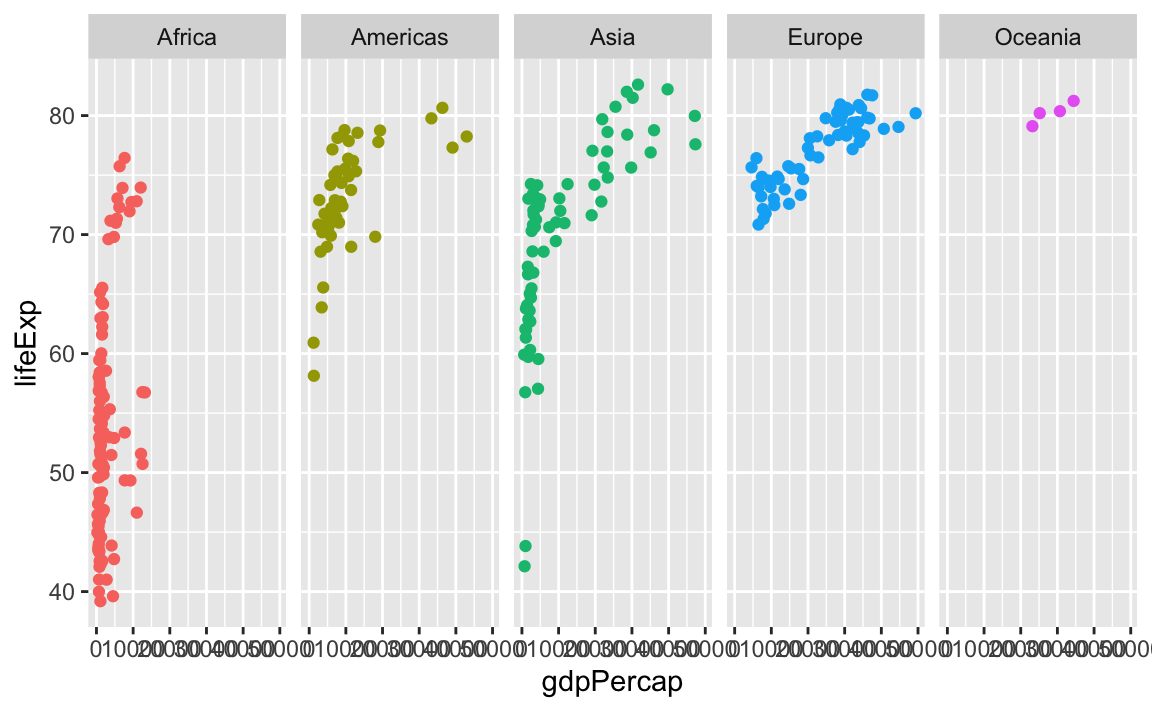
You can facet by multiple variables with facet_wrap(). Instead of adding the labels to the top and the side like with facet_grid(), they get stacked on top of each other:
ggplot(gapminder_small, aes(x = gdpPercap, y = lifeExp, color = continent)) +
  geom_point() +
  guides(color = "none") +
  facet_wrap(vars(year, continent), ncol = 5)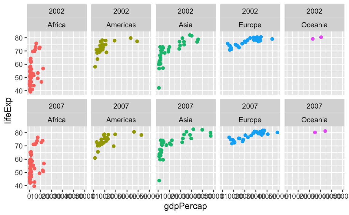
Why do I sometimes see facet_wrap(vars(blah)) and sometimes facet_wrap(~ blah)?
facet_wrap(vars(blah)) and facet_wrap(~ blah) do the same thing. The ~ syntax is older and getting deprecated; the vars() syntax is the nicer newer way of specifying the variables to facet. Use vars(blah).
What’s the difference between the fill and color aesthetics?
This is one of the trickiest things to remember at the beginning of learning ggplot! You learned how to add colors to your plots early on—use the color aesthetic!
library(gapminder)

gapminder_small <- gapminder |>
  filter(year >= 2000)

ggplot(gapminder_small, aes(x = gdpPercap, y = lifeExp, color = continent)) +
  geom_point() +
  scale_x_log10()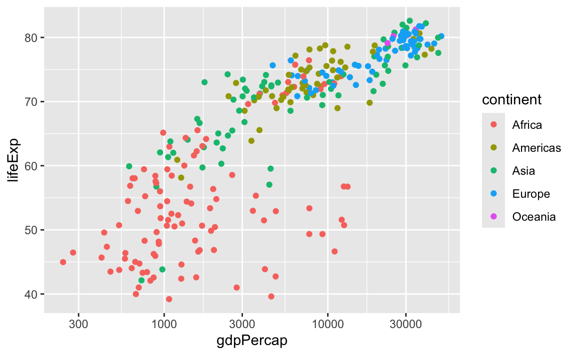
If you make a plot with geom_col(), it feels logical and natural to use color there too! But doing that gives you unexpected results:
gapminder_avg_lifeexp <- gapminder_small |>
  group_by(continent) |>
  summarize(avg_lifeexp = mean(lifeExp))

ggplot(
  gapminder_avg_lifeexp,
  aes(x = continent, y = avg_lifeexp, color = continent)
) +
  geom_col()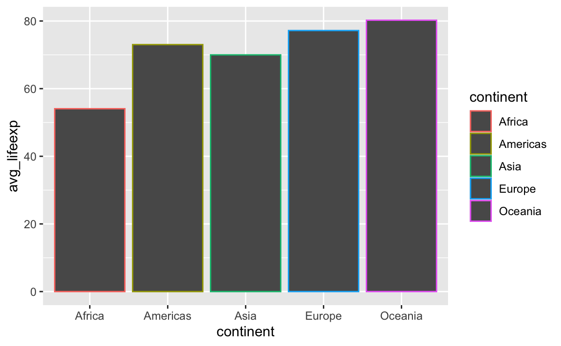
Using color with geom_col() controls the border of the bars, not the bars themselves. This is the case for anything else that involves shapes, like geom_histogram(), geom_area(), and so on. If you want to control the insides of the bars, you should use fill:
ggplot(
  gapminder_avg_lifeexp,
  aes(x = continent, y = avg_lifeexp, fill = continent)
) +
  geom_col()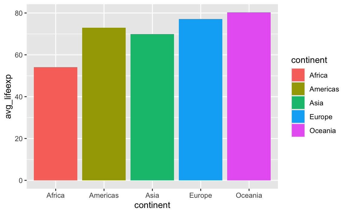
Here’s the best way to remember the difference:
ImportantFill vs. Color
fillcontrols the inside of geomscolorcontrols the outside of geoms
If a geom doesn’t have an inside, like geom_line(), you can only use color—fill won’t do anything because lines don’t have an area to fill. geom_point() is similar—individual points don’t generally have an inside and an outside, so they only use color.*
NoteFilled points
*jklol, saying that points can’t be filled isn’t quite accurate. It’s possible to tell ggplot to use geom_point() with a fillable point.
R and ggplot have 26 possible shapes that you can use, and they’re numbered 0–25. You can see what they are in the documentation if you run ?pch in the console, which (maybe??) stands for “point character” (I think??):
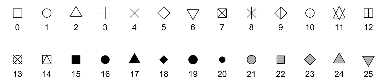
The default shape for geom_point() is 19, which is a solid circle. The shapes 0–14 are all hollow, while shapes 15–20 are solid, and they all are controlled with the color aesthetic. Notice how shapes 21–25 are filled with gray, though? That’s because they’re special. Those shapes can have both color and fill—color controls the border (or stroke), while fill controls the inside.
If you tell geom_point() to use shape 21 (or any of 21–25), you can use both color and fill. One common reason for doing this is adding a little white border around the points to make them more visible:
ggplot(gapminder_small, aes(x = gdpPercap, y = lifeExp, fill = continent)) +
  # The stroke argument here controls the thickness of the border
  geom_point(shape = 21, stroke = 0.5, size = 3, color = "white") +
  scale_x_log10()