What’s the difference between statistical significance and substantial significance?
All that statistical significance really tells you is how confident you are that a measured effect is not zero. Or, more formally, using our null world idea, if something is significant, it means that in a hypothetical world where the effect is actually zero, the probability of seeing your measured effect is really low (less than 5%).
But most of the time we don’t care if an effect is maybe zero or not zero. We want to know if the effect actually matters!
Here’s a little example. Let’s say you work for a nonprofit that is launching a new educational program for people who have recently released been released from prison. You create an RCT of 325 people and randomly assign some people to the program, and your main outcome of interest is monthly income.
example_data1## # A tibble: 325 × 4## person_id group pre_income post_income## <int> <chr> <dbl> <dbl>## 1 1 Treatment 3259. 3755.## 2 2 Treatment 3555. 3328.## 3 3 Treatment 3717. 4045.## 4 4 Control 3031. 3554.## 5 5 Control 3586. 3585.## 6 6 Control 3601. 4262.## 7 7 Control 3385. 3375.## 8 8 Treatment 3391. 3033.## 9 9 Treatment 3387. 3796.## 10 10 Treatment 3322. 2751.## # ℹ 315 more rows
Let’s look at the difference in post-program incomes between the treatment and control groups. This will be the causal effect of the program:
model1 <-lm(post_income ~ group, data = example_data1)model_parameters(model1)## Parameter | Coefficient | SE | 95% CI | t(323) | p## ------------------------------------------------------------------------------## (Intercept) | 3515.45 | 48.92 | [3419.21, 3611.70] | 71.86 | < .001## group [Treatment] | 136.71 | 66.67 | [ 5.55, 267.87] | 2.05 | 0.041## ## Uncertainty intervals (equal-tailed) and p-values (two-tailed) computed using a Wald t-distribution approximation.
Cool. It looks like the program caused monthly incomes to increase by $136.71.
That result is statistically significant, with a p-value of 0.041. That means that in a world where the actual program effect is ≈0, there’s a 4.1% chance of seeing an effect of $136.71 or larger. That’s not super rare to see in a null world, but it’s below the completely arbitrary 5% threshold, so we declare that it’s significant.
The confidence interval shows that we’re 95% confident that the range $5.55 and $267.87 has captured the true effect. Zero isn’t in that range, so we’re again pretty certain that the effect isn’t zero.
Statistically significant? ✓
Does that finding matter? Are you, as the program manager, happy that the program is boosting monthly incomes by $137 on average? Probably!
Let’s look at another example. Let’s say you run the RCT and get this data instead:
example_data2## # A tibble: 4,000 × 4## person_id group pre_income post_income## <int> <chr> <dbl> <dbl>## 1 1 Control 3494. 3494.## 2 2 Treatment 3501. 3502.## 3 3 Control 3505. 3505.## 4 4 Control 3488. 3488.## 5 5 Treatment 3502. 3503.## 6 6 Control 3503. 3503.## 7 7 Control 3497. 3497.## 8 8 Treatment 3497. 3498.## 9 9 Treatment 3497. 3498.## 10 10 Treatment 3496. 3496.## # ℹ 3,990 more rows
Let’s look at this new causal effect:
model2 <-lm(post_income ~ group, data = example_data2)model_parameters(model2)## Parameter | Coefficient | SE | 95% CI | t(3998) | p## -------------------------------------------------------------------------------## (Intercept) | 3500.00 | 0.11 | [3499.78, 3500.22] | 31330.00 | < .001## group [Treatment] | 0.51 | 0.16 | [ 0.20, 0.82] | 3.25 | 0.001## ## Uncertainty intervals (equal-tailed) and p-values (two-tailed) computed using a Wald t-distribution approximation.
The effect of the program is still positive—it causes a $0.51 increase in monthly incomes, on average.
Importantly, the p-value is really really tiny: it’s 0.001164 (which, following APA style, model_parameters() reports as “p < 0.001”). The effect is definitely statistically significant! In a world where the effect of the program is ≈0, there’s a 0.1164% chance of seeing an effect as big as $0.51.
BUUUUUT does it matter? Are you, as the program manager, happy that the program is boosting monthly incomes by $0.51 on average? Should you spend tons of organizational resources to run this program if it’s only giving people fifty more cents every month? I’d guess probably not.
Both of these causal effects are statistically significant. But only the first is substantively important.
Can we measure substantial significance with statistics?
No, not really. Kind of.
You have to rely on your knowledge of the subject and the data and the context to know if the measured effect really matters.
There are some more systematic ways to assess substantiveness beyond just managerial vibes, like these:
Justin Esarey and Nathan Danneman, “A Quantitative Method for Substantive Robustness Assessment,” Political Science Research and Methods 3, no. 1 (2015): 95–111, https://doi.org/10.1017/psrm.2014.14.
Justin H. Gross, “Testing What Matters (If You Must Test at All): A Context‐Driven Approach to Substantive and Statistical Significance,” American Journal of Political Science 59, no. 3 (2015): 775–88, https://doi.org/10.1111/ajps.12149.
But often—especially for practical program evaluation situations where stakeholders have a lot of sway in program implementation and other decisions—the determination of a result’s substantiveness is mostly vibes-based.
What are all the different ways we can look at model coefficients?
In problem set 2, you fed your model objects to model_parameters() to see the coefficients, and also fed them to modelsummary() to see the coefficients. What’s going on here with these different functions?
As I noted in the little mini-lesson on regression in the middle of problem set 2, R returns regression models as objects that you can do stuff with.
For instance, here’s a little model based on penguins data:
some_model <-lm(body_mass ~ bill_dep + species, data = penguins)
That new some_model object has the model results (coefficients, standard errors, p-values, diagnostics like R², etc.) stored inside it. If you want to know what those are or do things with them, you have to look at the object.
There are lots of different ways to do this!
Print the object name
You can just run the name of the object and see a very barebones representation of the results:
↑ That shows the model formula that you used + the coefficients. There are no standard errors, p-values, or anything else, really.
Use summary()
You can feed some_model to the summary() function to see a more detailed set of results:
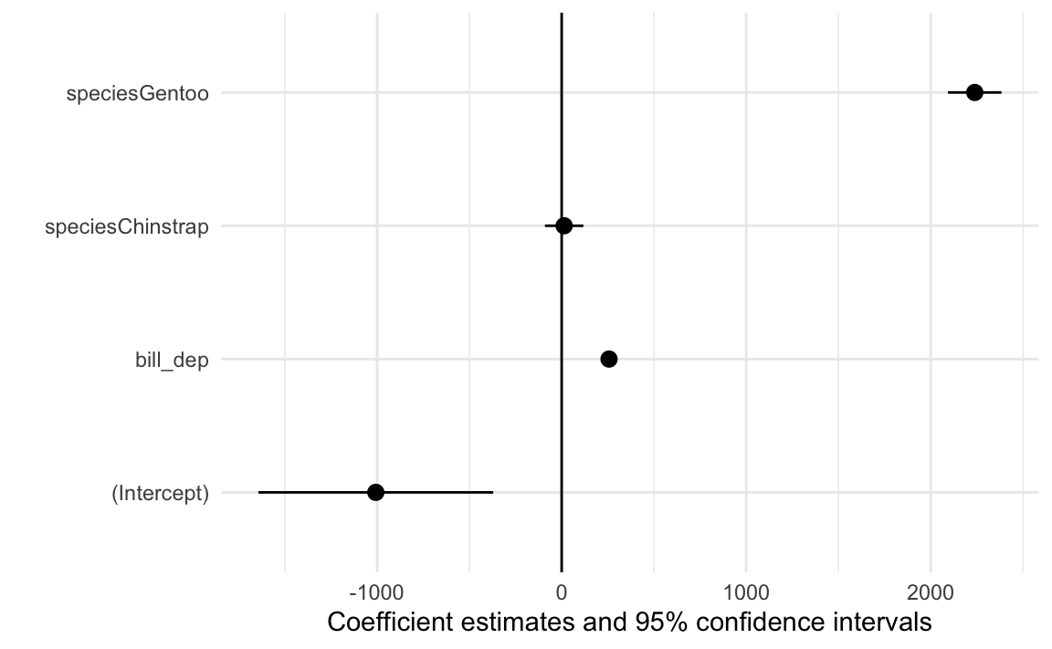
summary(some_model)## ## Call:## lm(formula = body_mass ~ bill_dep + species, data = penguins)## ## Residuals:## Min 1Q Median 3Q Max ## -867.73 -255.61 -27.41 242.41 1190.86 ## ## Coefficients:## Estimate Std. Error t value Pr(>|t|) ## (Intercept) -1007.28 323.56 -3.113 0.00201 ** ## bill_dep 256.61 17.56 14.611 < 2e-16 ***## speciesChinstrap 13.38 52.95 0.253 0.80069 ## speciesGentoo 2238.67 73.68 30.383 < 2e-16 ***## ---## Signif. codes: 0 '***' 0.001 '**' 0.01 '*' 0.05 '.' 0.1 ' ' 1## ## Residual standard error: 362.4 on 338 degrees of freedom## (2 observations deleted due to missingness)## Multiple R-squared: 0.7975, Adjusted R-squared: 0.7957 ## F-statistic: 443.8 on 3 and 338 DF, p-value: < 2.2e-16
↑ That gives you a big wall of text (similar to what you see in Stata, if you’re used to Stata), with coefficients, standard errors, t-statistics, p-values, and model details like R² and the number of observations and so on.
That’s fine, but it’s really gross when that wall of text appears in a rendered Quarto document. Also, it’s really hard to do anything with those values. Like, what if you want to round the values? Or plot them? Or only show some of the coefficients? They’re all locked into this chunk of text.
Use tidy() from the {broom} package
The {broom} package (tangentially part of the tidyverse ecosystem) provides functions for converting model objects into data frames that are much easier to work with.
There are two general functions: tidy() for extracting coefficient details and glance() for extracting model details:
Because tidy() returns a data frame, you can do all the regular dplyr stuff to it, like filtering, mutating, selecting, grouping, summarizing, and so on. Like, here’s just the coefficient for bill depth, without the statistic column:
Use model_parameters() and model_performance() from the {parameters} and {performance} packages
{broom} is great and nice and I use it all the time in my own work, but it has a few inconveniences:
tidy() doesn’t show confidence intervals by default. If you want to see those, you have to include conf.int = TRUE. It’s not a big deal, just kind of annoying to have to do all the time:
tidy() shows the raw p-value, often in scientific notation like 8.10e-38. Students will often see that and forget that it really means\(8.1 \times 10^{-38}\) and will think that the p-value is 8.1 or something impossible. Again, not a deal-breaker—just an extra thing to have to think about when looking at the results.
The function names tidy() and glance() don’t really describe what they’re doing. You just have to remember that tidy() shows the model parameters and coefficients and glance() shows the model performance details.
To make life easier, there’s a collection of package (similar to the tidyverse package ecosystem idea) called easystats that contains a bunch of packages and functions to make it easier to work with models. Two of the easystats packages that you’ve already used are {parameters} and {performance}
These packages fix all the minor inconveniences of {broom} and give you a lot of other neat features.
model_parameters() shows confidence intervals by default
model_parameters() shows an APA-style p-value, where it displays as p < 0.001 when it’s really small—no more 8.10e-38!
Instead of remembering that tidy() shows you model parameters, and glance() shows you model performance details, you can use model_parameters() and model_performance()
library(parameters)library(performance)model_parameters(some_model)## Parameter | Coefficient | SE | 95% CI | t(338) | p## ----------------------------------------------------------------------------------## (Intercept) | -1007.28 | 323.56 | [-1643.73, -370.83] | -3.11 | 0.002 ## bill dep | 256.61 | 17.56 | [ 222.07, 291.16] | 14.61 | < .001## species [Chinstrap] | 13.38 | 52.95 | [ -90.77, 117.52] | 0.25 | 0.801 ## species [Gentoo] | 2238.67 | 73.68 | [ 2093.74, 2383.60] | 30.38 | < .001## ## Uncertainty intervals (equal-tailed) and p-values (two-tailed) computed using a Wald t-distribution approximation.model_performance(some_model)## # Indices of model performance## ## AIC | AICc | BIC | R2 | R2 (adj.) | RMSE | Sigma## ----------------------------------------------------------------## 5007.2 | 5007.4 | 5026.4 | 0.798 | 0.796 | 360.310 | 362.436
You can also display these as actual tables in a Quarto document if you pipe them to display():
model_parameters(some_model) |>display()
Parameter
Coefficient
SE
95% CI
t(338)
p
(Intercept)
-1007.28
323.56
(-1643.73, -370.83)
-3.11
0.002
bill dep
256.61
17.56
(222.07, 291.16)
14.61
< .001
species (Chinstrap)
13.38
52.95
(-90.77, 117.52)
0.25
0.801
species (Gentoo)
2238.67
73.68
(2093.74, 2383.60)
30.38
< .001
You can tell model_parameters() which parameters you want to show or not show without needing to use filter():
model_parameters(some_model, keep ="bill_dep", verbose =FALSE)## Parameter | Coefficient | SE | 95% CI | t(338) | p## --------------------------------------------------------------------## bill dep | 256.61 | 17.56 | [222.07, 291.16] | 14.61 | < .001
Even though it’s printing nicely as a table, the results from model_parameters() are actually a data frame, so you can do all the regular dplyr stuff with them just like with tidy():
Make nice polished side-by-side regression tables with {modelsummary}
model_parameters() and model_performance() (or tidy() and glance() from {broom}) are great for working with models on their own, but often you’ll want to show a bunch of models all at once. In problem set 2, I had you do this with modelsummary() from the {modelsummary} package. Check out its documentation here.:
Notemodelsummary() and easystats
modelsummary() actually uses model_parameters() and model_performance() behind the scenes to extract all these numbers from the models and build the fancy table!
You can customize these tables a lot (again, see the documentation). Like, here we can rename the coefficients, change the column names, show confidence intervals instead of standard errors, and control which goodness-of-fit statistics (GOF) appear in the bottom half:
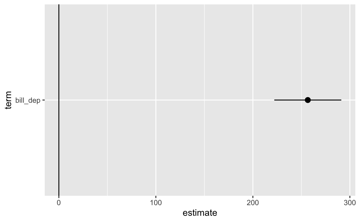
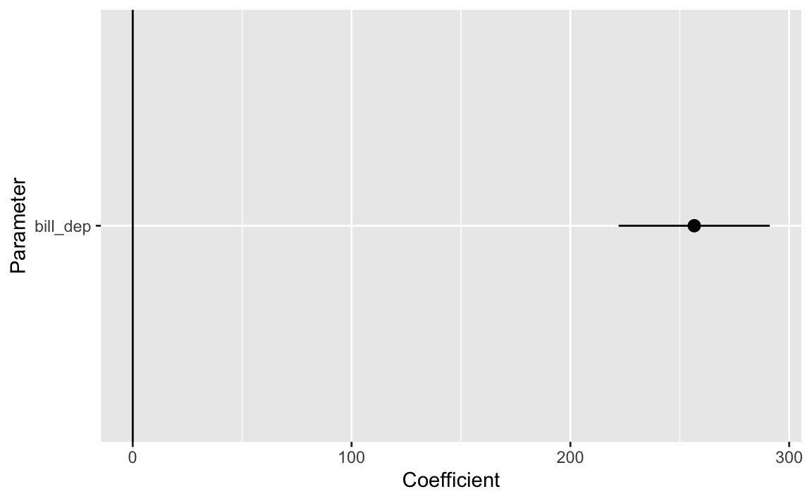
Make automatic coefficient plots with modelplot() from {modelsummary}
If you like coefficient plots but don’t want to build them yourself with ggplot, like we did above, {modelsummary} also comes with a modelplot() function (see the full documentation here):
modelplot(some_model) +geom_vline(xintercept =0)
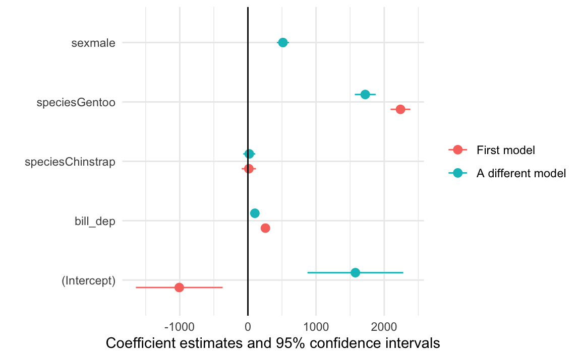
You can automatically plot multiple models too, either as colored lines:
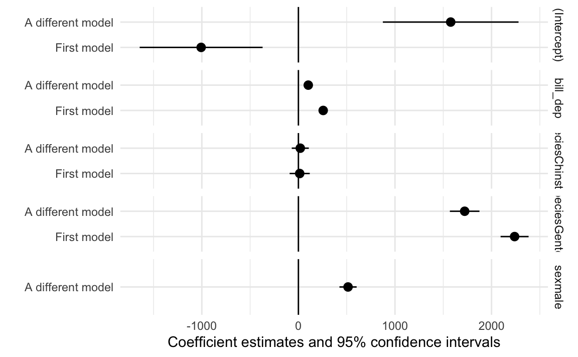
another_model <-lm(body_mass ~ bill_dep + species + sex, data = penguins)modelplot(list("First model"= some_model, "A different model"= another_model)) +geom_vline(xintercept =0)
Or in facets:
modelplot(list("First model"= some_model, "A different model"= another_model),facet =TRUE) +geom_vline(xintercept =0)
Plot model predictions and marginal effects
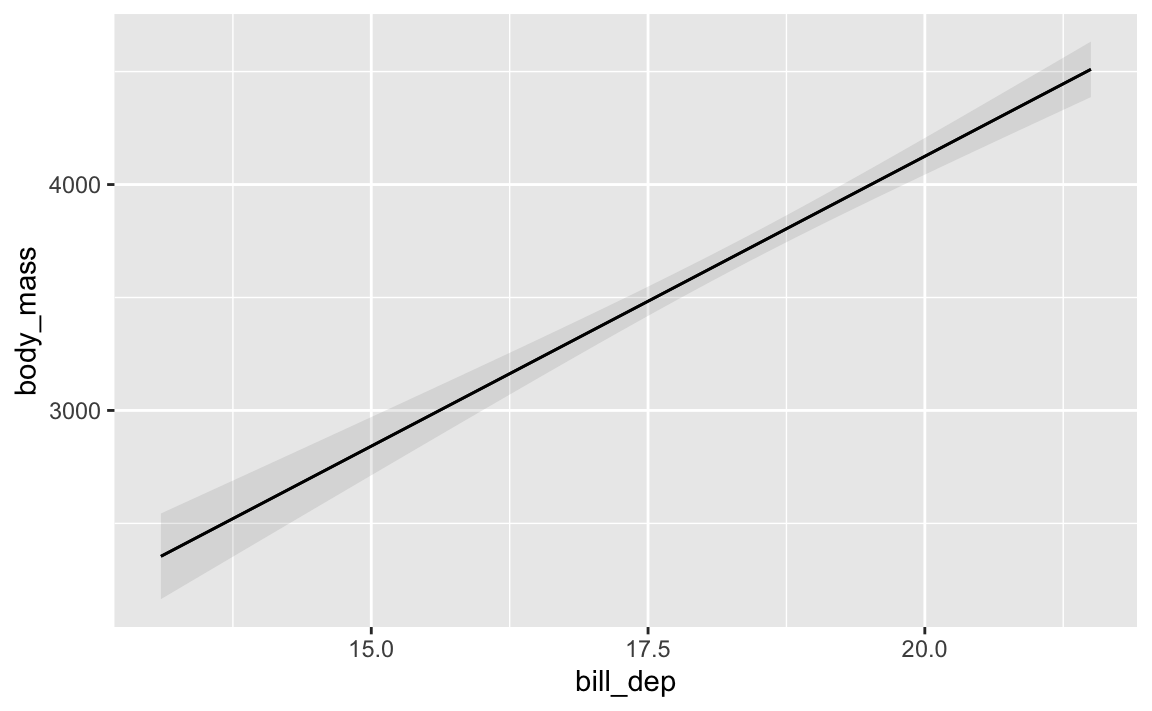
You can do some other really neat things with model objects with the {marginaleffects} package, which lets you plot predictions and slopes and other things you might be interested in.
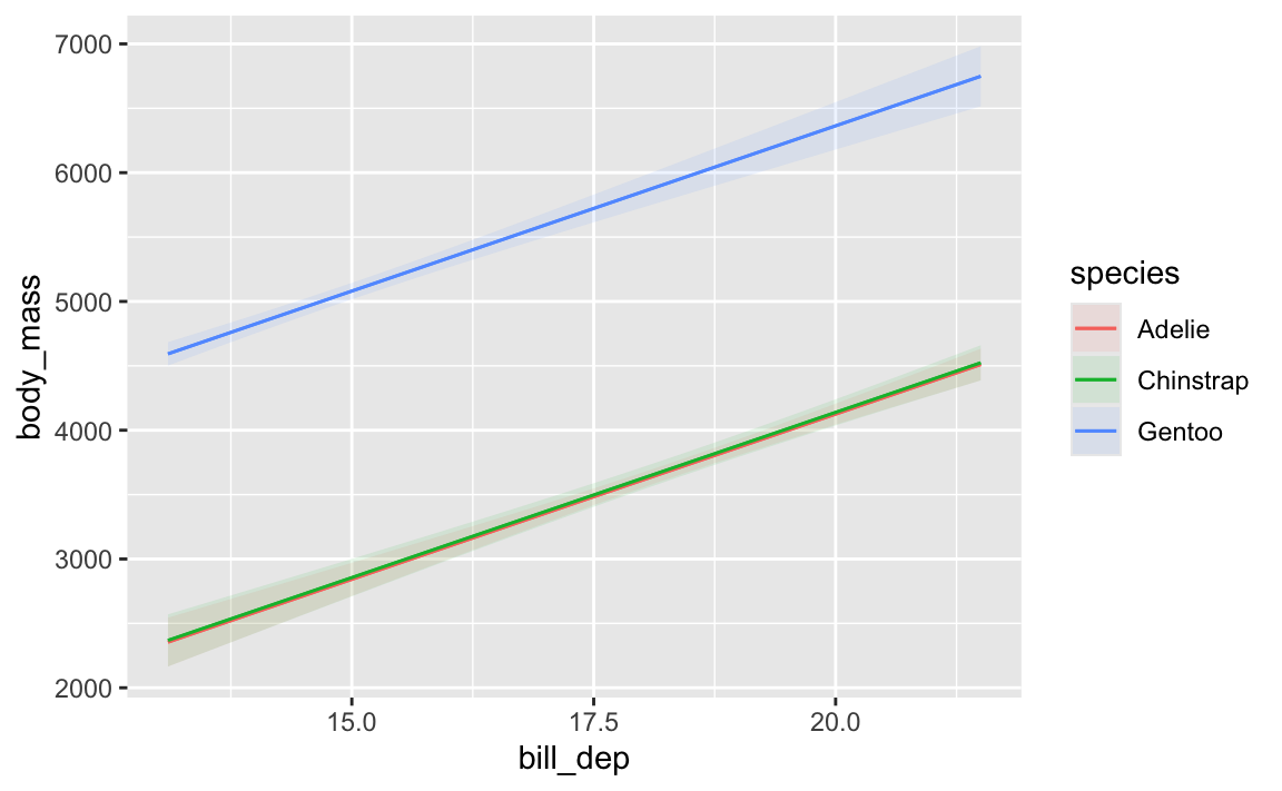
Like, here’s how predicted body mass changes across a range of possible bill depths:
That Gentoo line has a steeper slope than the other two species. We could figure out those slopes by looking at the coefficients and then adding/subtracting the different interaction terms:
model_parameters(model_interaction)## Parameter | Coefficient | SE | 95% CI | t(336) | p## ---------------------------------------------------------------------------------------------## (Intercept) | -283.28 | 437.94 | [-1144.73, 578.17] | -0.65 | 0.518 ## bill dep | 217.15 | 23.82 | [ 170.30, 264.00] | 9.12 | < .001## species [Chinstrap] | 247.06 | 829.77 | [-1385.14, 1879.26] | 0.30 | 0.766 ## species [Gentoo] | -175.71 | 658.43 | [-1470.88, 1119.47] | -0.27 | 0.790 ## bill dep × species [Chinstrap] | -12.53 | 45.01 | [ -101.06, 76.01] | -0.28 | 0.781 ## bill dep × species [Gentoo] | 152.29 | 40.49 | [ 72.64, 231.94] | 3.76 | < .001## ## Uncertainty intervals (equal-tailed) and p-values (two-tailed) computed using a Wald t-distribution approximation.
…but that’s annoying! avg_slopes() lets us get species-specific slopes automatically:
For Gentoos, a 1 mm increase in bill depth is associated with a 369 g increase in body mass, while for Chinstraps a 1 mm increase in bill depth is associated with a 205 g increase in body mass. Neat.
Automatic interpretation with {report}
Finally, remember that whole template thing you learned in past stats classes about how to interpret regression coefficients? The {report} package (which is part of the larger easystats ecosystem) does this for you!
library(report)report_text(some_model)## We fitted a linear model (estimated using OLS) to predict body_mass with bill_dep and species## (formula: body_mass ~ bill_dep + species). The model explains a statistically significant and## substantial proportion of variance (R2 = 0.80, F(3, 338) = 443.84, p < .001, adj. R2 = 0.80). The## model's intercept, corresponding to bill_dep = 0 and species = Adelie, is at -1007.28 (95% CI## [-1643.73, -370.83], t(338) = -3.11, p = 0.002). Within this model:## ## - The effect of bill dep is statistically significant and positive (beta = 256.61, 95% CI [222.07,## 291.16], t(338) = 14.61, p < .001; Std. beta = 0.63, 95% CI [0.55, 0.72])## - The effect of species [Chinstrap] is statistically non-significant and positive (beta = 13.38,## 95% CI [-90.77, 117.52], t(338) = 0.25, p = 0.801; Std. beta = 0.02, 95% CI [-0.11, 0.15])## - The effect of species [Gentoo] is statistically significant and positive (beta = 2238.67, 95% CI## [2093.74, 2383.60], t(338) = 30.38, p < .001; Std. beta = 2.79, 95% CI [2.61, 2.97])## ## Standardized parameters were obtained by fitting the model on a standardized version of the## dataset. 95% Confidence Intervals (CIs) and p-values were computed using a Wald t-distribution## approximation.
How do I change the reference category for a categorical variable?
By default, R omits the first category in alphabetic order in a regression. Like here, there are three penguin species: Adelie, Chinstrap, and Gentoo. Adelie comes first, so it is omitted and all the coefficients are in relation to Adelies:
model_species <-lm(body_mass ~ species, data = penguins)model_parameters(model_species)## Parameter | Coefficient | SE | 95% CI | t(339) | p## --------------------------------------------------------------------------------## (Intercept) | 3700.66 | 37.62 | [3626.67, 3774.66] | 98.37 | < .001## species [Chinstrap] | 32.43 | 67.51 | [-100.37, 165.22] | 0.48 | 0.631 ## species [Gentoo] | 1375.35 | 56.15 | [1264.91, 1485.80] | 24.50 | < .001## ## Uncertainty intervals (equal-tailed) and p-values (two-tailed) computed using a Wald t-distribution approximation.
Chinstraps are a little heavier than Adelies; Gentoos are a lot heavier than Adelies.
But what if you want to change the reference category or base case? Like, what if we want Gentoos to be omitted?
To do this, you need to change the order of the levels in the species column. You can see what the current level order is using levels(), like this:
Now Gentoo comes first. If we make a regression model with this new column, Gentoos will be omitted:
model_species1 <-lm(body_mass ~ species, data = penguins_modified)model_parameters(model_species1)## Parameter | Coefficient | SE | 95% CI | t(339) | p## ----------------------------------------------------------------------------------## (Intercept) | 5076.02 | 41.68 | [ 4994.03, 5158.00] | 121.78 | < .001## species [Adelie] | -1375.35 | 56.15 | [-1485.80, -1264.91] | -24.50 | < .001## species [Chinstrap] | -1342.93 | 69.86 | [-1480.34, -1205.52] | -19.22 | < .001## ## Uncertainty intervals (equal-tailed) and p-values (two-tailed) computed using a Wald t-distribution approximation.
Cool cool. Adelies and Chinstraps are both way lighter than Gentoos on average.
Importantly, none of the results here actually changed—everything is exactly the same. The reference category ultimately doesn’t matter. All that changed is the reference—these numbers are in relation to Gentoos.
Another reason this doesn’t matter is that you can use things like predictions() from {marginaleffects} to see predicted values of species weights, and it’ll automatically work with whatever the reference category is.
For instance, here are the predicted weights for the three species using the model where Adelies are the reference category: